10 Color Drench Living Room Ideas
Color drenching is one of the easiest ways to make a living room feel intentional, elevated, and unforgettable. Instead of treating walls, trim, furniture, and decor as separate pieces, this approach wraps the room in one dominant color story for a rich, immersive look. It can feel moody and dramatic, soft and calming, or warm and playful depending on the shade you choose. The best part is that it works in both large open spaces and smaller living rooms that need more personality. With the right styling, color drenching creates depth without relying on clutter or too many contrasting accents. These living room ideas are designed to help you use color confidently while still keeping your space practical, welcoming, and easy to live in every day. Each idea blends style, comfort, and simple decorating decisions that look polished.
Quick List:
- Deep Olive Green Cocoon
- Dusty Blue Wall-to-Decor Flow
- Warm Terracotta Layered Living Room
- Soft Taupe Monochrome Comfort Zone
- Charcoal Gray Modern Drama
- Muted Plum Cozy Statement Space
- Sand Beige Sunwashed Serenity
- Navy Blue Classic Color Wrap
- Rust and Clay Earthy Immersion
- Sage Green Light and Airy Drench
Deep Olive Green Cocoon
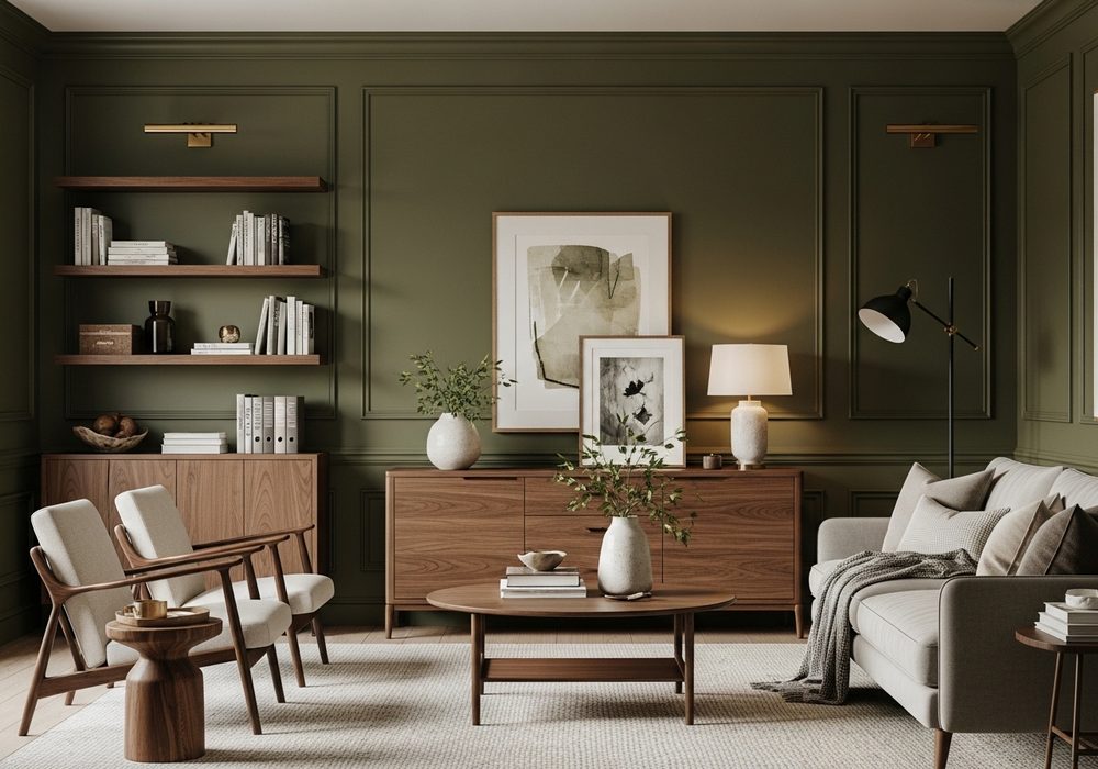
Deep olive green creates a grounded living room that feels restful, expensive, and full of character without becoming too dark. Paint the walls, trim, shelving, and even a media unit in the same olive family to build a seamless cocoon effect. Add a sofa in moss, velvet, or textured linen to continue the look. Warm wood tones, aged brass, and cream accents keep the room balanced. This idea works especially well when you want a cozy atmosphere that still feels refined, layered, and naturally connected to nature.
Best For: Cozy homes, reading corners, and living rooms that need warmth.
Where To Place It: Main living rooms with natural light or corners with wood furniture.
Color Palette Tip: Pair olive with cream, walnut brown, muted gold, and soft black.
Materials / Items Needed: olive paint, matching trim paint, green sofa, wood coffee table, brass lamp, cream throw pillows, textured rug
Budget Level: Medium – Paint does most of the work, then layer in a few key pieces.
DIY Difficulty: Easy – A strong paint plan makes this look surprisingly simple to achieve.
Style It Like This: Use tonal green cushions. Add warm wood surfaces. Finish with brass or antique metal accents.
Common Mistake To Avoid: Using bright cool white lighting that makes olive feel flat or harsh.
Dusty Blue Wall-to-Decor Flow
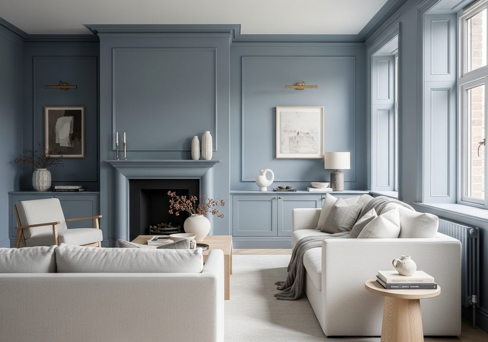
Dusty blue is perfect for a living room that feels calm, polished, and gently colorful without looking too themed. Color drench the walls, built-ins, trim, and selected decor pieces in soft blue-gray tones for a quiet layered effect. A matching sofa or accent chairs can deepen the look beautifully. Bring in pale oak, off-white textiles, and brushed nickel or chrome details to lighten the mood. This idea is great for anyone who wants a serene space that feels fresh, airy, and put together from every angle.
Best For: Relaxed family rooms, apartment living rooms, and quiet contemporary spaces.
Where To Place It: Rooms with large windows, pale flooring, or soft northern light.
Color Palette Tip: Blend dusty blue with soft white, light oak, silver, and foggy gray.
Materials / Items Needed: dusty blue paint, blue curtains, blue accent chair, pale wood table, neutral rug, ceramic vases, soft lighting
Budget Level: Medium – Paint and textiles create the biggest visual change for less.
DIY Difficulty: Easy – Stick to one muted blue family and repeat it consistently.
Style It Like This: Layer blue shades subtly. Use pale wood to lift the room. Keep metal finishes minimal and clean.
Common Mistake To Avoid: Mixing too many bright blues that break the soft draped effect.
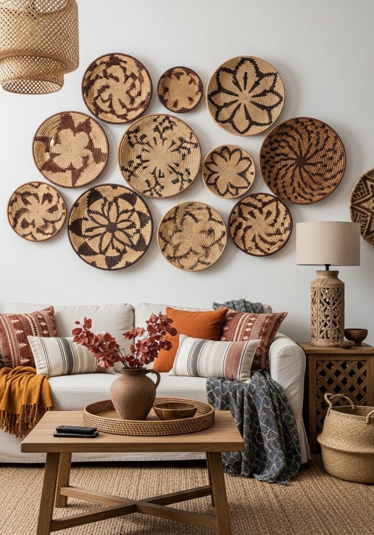
Warm Terracotta Layered Living Room
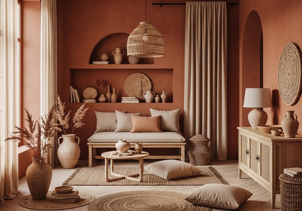
Terracotta brings instant warmth and gives a living room a welcoming, sunbaked richness that feels both earthy and stylish. Use terracotta across walls, trim, and textiles, then repeat the shade in pottery, cushions, and artwork for a layered color-drench effect. The room will feel especially inviting when paired with natural fibers like jute, linen, and cotton. To keep the palette from feeling heavy, mix in soft beige and clay variations rather than sharp contrast. This look is ideal for cozy homes that need color, depth, and personality.
Best For: Warm minimalist homes, boho spaces, and earthy everyday living rooms.
Where To Place It: South-facing rooms or spaces that need warmth and visual energy.
Color Palette Tip: Combine terracotta with sand, clay, oatmeal, and muted caramel tones.
Materials / Items Needed: terracotta paint, clay-toned cushions, linen curtains, jute rug, ceramic decor, wood side table, woven basket
Budget Level: Low – This look can be built beautifully with paint and simple natural textures.
DIY Difficulty: Easy – Earthy tones are forgiving and easy to layer naturally.
Style It Like This: Add handmade pottery. Use woven textures generously. Keep contrast soft, not stark.
Common Mistake To Avoid: Pairing terracotta with icy gray, which weakens its natural warmth.
Soft Taupe Monochrome Comfort Zone
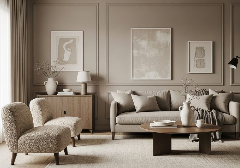
A soft taupe living room feels understated, elevated, and incredibly easy to live with every single day. Color drenching in taupe works by wrapping the walls, trim, curtains, and upholstery in close shades that blend together rather than compete. The result is a quiet, comfortable room with a designer feel. Mix boucle, linen, wool, and matte ceramics to keep the monochrome palette interesting and tactile. This idea is perfect for people who love neutral spaces but still want depth, softness, and a carefully styled finish that never feels boring.
Best For: Neutral lovers, modern homes, and calm living rooms with soft textures.
Where To Place It: Open-plan spaces, condos, or rooms connected to dining areas.
Color Palette Tip: Use taupe with ivory, mushroom, greige, and warm beige for dimension.
Materials / Items Needed: taupe paint, neutral sofa, boucle chair, linen curtains, wool rug, ceramic vase, soft lighting, wood tray
Budget Level: Medium – Texture matters here, so spend on a few tactile pieces.
DIY Difficulty: Easy – Staying within one soft family keeps choices simple and cohesive.
Style It Like This: Mix fabric textures. Keep shapes clean and rounded. Add subtle wood for warmth.
Common Mistake To Avoid: Choosing taupe shades with clashing undertones across paint and textiles.
Charcoal Gray Modern Drama
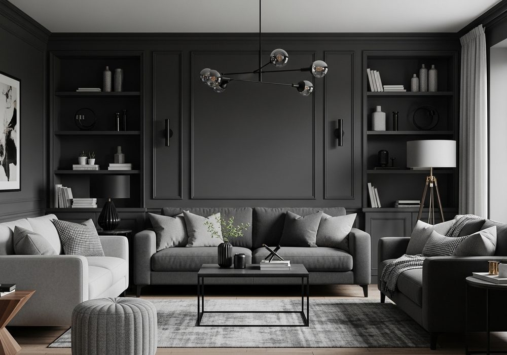
Charcoal gray creates a dramatic living room that feels sleek, intimate, and surprisingly sophisticated when done with care. Paint walls, trim, shelving, and even selected furniture in layered charcoal tones to create a bold envelope around the room. Keep the space from feeling heavy by including soft lighting, plush upholstery, and a few warm materials like walnut or cognac leather. Matte black decor can enhance the modern edge beautifully. This idea suits anyone who wants a high-impact space that feels clean, stylish, and confidently different from standard neutral living rooms.
Best For: Modern interiors, media rooms, and bold city apartments.
Where To Place It: Living rooms with strong natural light or layered lamps.
Color Palette Tip: Pair charcoal with warm wood, black, ivory, and deep brown accents.
Materials / Items Needed: charcoal paint, dark shelving, gray sofa, black floor lamp, walnut table, textured rug, soft throws
Budget Level: Medium – Lighting and texture are essential to make dark tones feel polished.
DIY Difficulty: Medium – Dark paint needs even coverage and thoughtful lighting balance.
Style It Like This: Use layered lamp light. Add one warm wood anchor piece. Keep decor edited and sculptural.
Common Mistake To Avoid: Leaving the room underlit, which makes charcoal feel dull instead of rich.
Muted Plum Cozy Statement Space
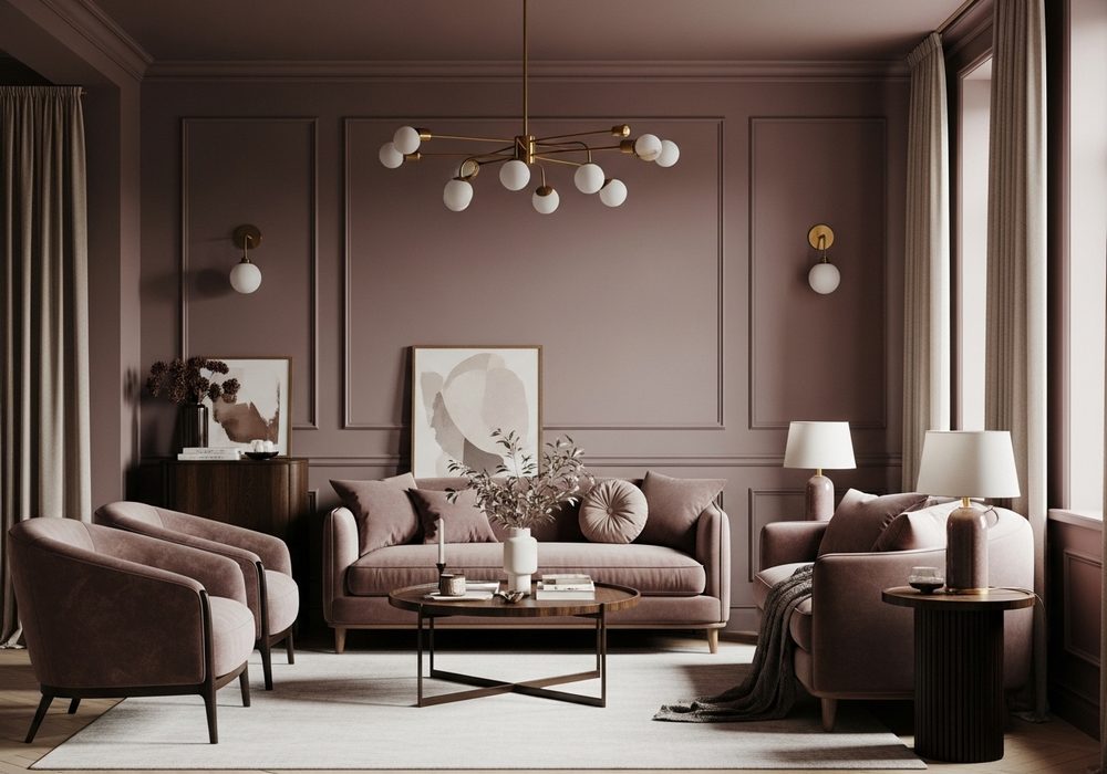
Muted plum gives a living room a cozy, creative mood while still feeling grown-up and elegant. Instead of using bright purple, choose dusty plum shades for walls, trim, and accent furniture so the color feels rich rather than loud. Continue the palette with mauve textiles, dark wood, and soft metallic details like brass or bronze. This creates a layered room that feels intimate and full of personality. It is an especially beautiful option for anyone who wants a statement space that remains warm, inviting, and comfortable enough for everyday use.
Best For: Artistic homes, cozy lounge rooms, and moody evening spaces.
Where To Place It: Smaller living rooms, dens, or quiet sitting areas.
Color Palette Tip: Blend muted plum with mauve, cocoa brown, brass, and warm cream.
Materials / Items Needed: plum paint, mauve cushions, dark wood table, velvet chair, brass lamp, soft curtains, textured throw
Budget Level: Medium – Rich color and a few plush accents make a strong impact.
DIY Difficulty: Easy – The key is choosing softened plum tones, not bright ones.
Style It Like This: Use velvet sparingly. Add dark wood depth. Balance with warm cream accessories.
Common Mistake To Avoid: Choosing overly saturated purple that feels juvenile instead of refined.
Sand Beige Sunwashed Serenity
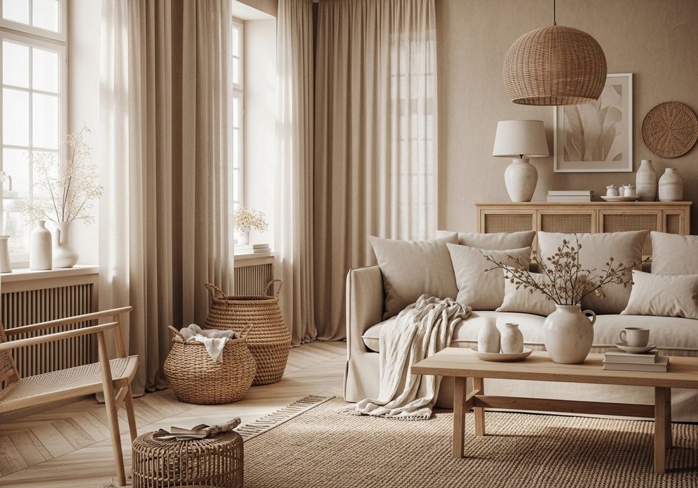
Sand beige is a beautiful choice for color drenching when you want a living room to feel bright, quiet, and naturally elegant. By carrying beige across walls, trim, curtains, and upholstery, the space becomes soft and visually calm without feeling plain. The secret is layering slightly different sandy tones and adding texture through linen, raw wood, and woven accents. This approach reflects light beautifully and works well in homes that lean airy and relaxed. It is ideal for creating a peaceful living room with subtle depth and an effortless everyday sense of comfort.
Best For: Coastal-inspired homes, bright apartments, and relaxed family spaces.
Where To Place It: Rooms with sunlight, sheer curtains, or pale wood floors.
Color Palette Tip: Mix sand beige with ivory, oat, honey wood, and soft stone.
Materials / Items Needed: beige paint, linen curtains, beige sofa, woven baskets, light wood table, textured rug, ceramic accents
Budget Level: Low – Neutral paint and natural textures make this very approachable.
DIY Difficulty: Easy – This palette is flexible and beginner-friendly to style.
Style It Like This: Layer woven pieces. Use sheer curtains. Keep decor organic and minimal.
Common Mistake To Avoid: Using flat beige everywhere without enough texture or tonal variation.
Navy Blue Classic Color Wrap
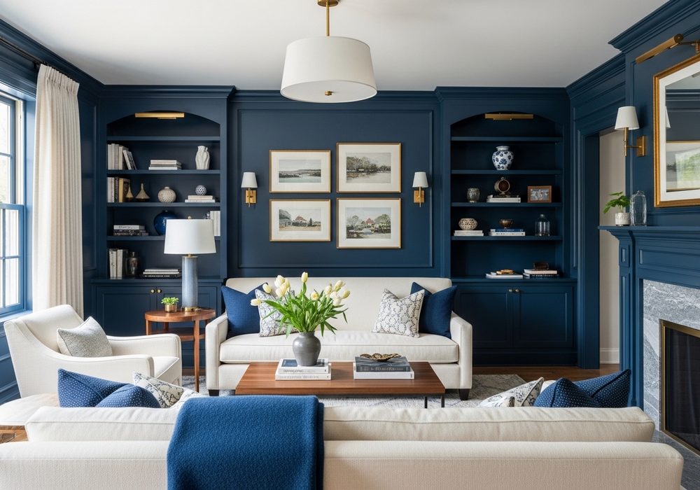
Navy blue gives a living room a timeless, tailored feel while still making a strong visual statement. For a color-drenched look, use navy on walls, trim, bookcases, and select furniture, then soften the intensity with cream textiles and warm wood finishes. The rich blue creates depth and structure, especially in rooms with high ceilings or architectural details. Brass lighting and framed art look especially striking against it. This idea works well for homeowners who want a bold room that still feels classic, polished, welcoming, and easy to dress up seasonally.
Best For: Traditional-modern homes, formal living rooms, and elegant family spaces.
Where To Place It: Rooms with molding, built-ins, or strong architectural lines.
Color Palette Tip: Pair navy with cream, walnut, brass, and soft camel accents.
Materials / Items Needed: navy paint, matching built-in paint, cream pillows, wood coffee table, brass sconces, framed art, wool rug
Budget Level: Medium – Navy paint is affordable, but lighting and balance matter.
DIY Difficulty: Medium – Dark blue needs testing in different light before committing.
Style It Like This: Add brass lighting. Use cream upholstery accents. Keep wood tones warm and classic.
Common Mistake To Avoid: Pairing navy with too many cold grays that drain its richness.
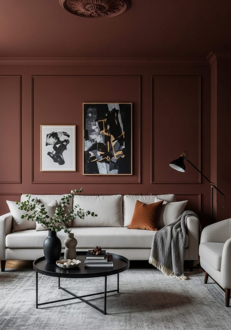
Rust and Clay Earthy Immersion
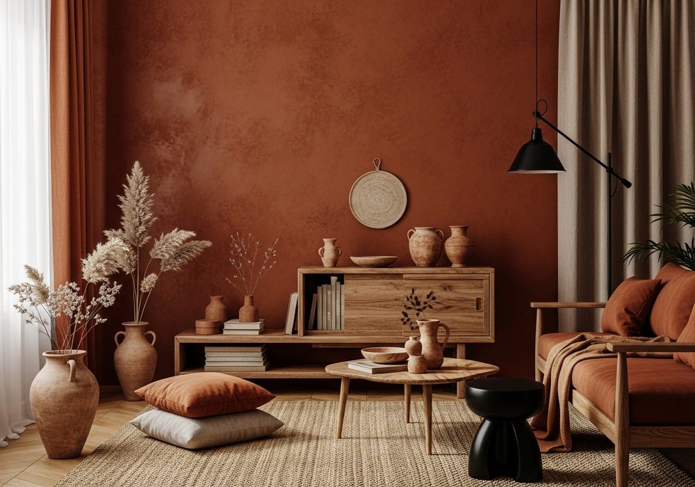
Rust and clay tones create a warm, collected living room that feels grounded, artistic, and deeply inviting. The color-drench approach works beautifully here because these earthy shades naturally blend into one another across walls, textiles, pottery, and upholstered pieces. Use rust as the dominant note, then support it with clay, cinnamon, and sand for a layered, tonal finish. Black accents can add structure, while soft cream keeps the room from feeling too dense. This is a strong choice for anyone who loves warm interiors with depth, character, and a handmade look.
Best For: Earthy interiors, eclectic homes, and rooms with vintage accents.
Where To Place It: Living rooms with textured walls, wood furniture, or lots of pottery.
Color Palette Tip: Combine rust with clay, cinnamon, cream, and matte black.
Materials / Items Needed: rust paint, clay cushions, pottery decor, black lamp, cream throw, woven rug, wood bench, linen curtains
Budget Level: Low – Small decor swaps can support the paint beautifully.
DIY Difficulty: Easy – Earth tones layer naturally and hide styling imperfections well.
Style It Like This: Cluster pottery pieces. Use warm textiles. Add black in small doses for contrast.
Common Mistake To Avoid: Making every element the exact same rust shade with no tonal depth.
Sage Green Light and Airy Drench
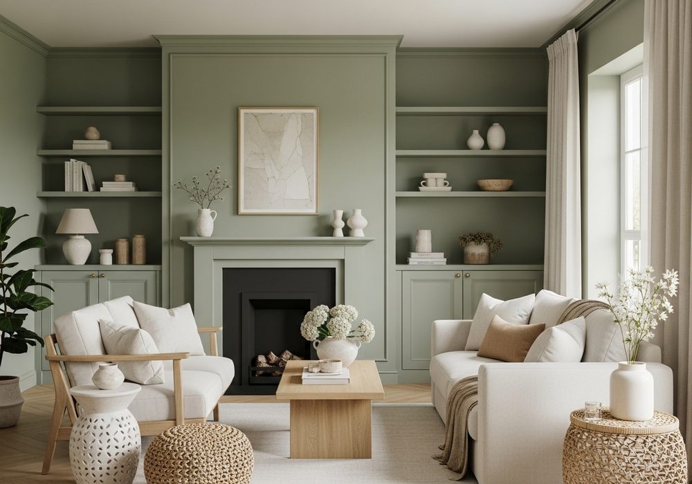
Sage green offers a fresh take on color drenching because it feels soft, natural, and easy to live with long term. Use sage on walls, trim, cabinetry, and supporting decor for a seamless look that feels airy instead of overpowering. This shade pairs beautifully with cream upholstery, pale wood, and simple organic textures. It can make a living room feel brighter while still introducing color in a calm and grounded way. This idea is perfect for anyone who wants a gentle, modern room with a relaxed mood and subtle personality.
Best For: Small living rooms, fresh modern homes, and nature-inspired spaces.
Where To Place It: Bright corners, open living areas, or rooms with light flooring.
Color Palette Tip: Pair sage with cream, pale oak, stone, and soft warm white.
Materials / Items Needed: sage paint, cream sofa, oak side table, textured curtains, woven rug, ceramic planters, soft pillows
Budget Level: Low – Sage paint and a few light accents can refresh a room fast.
DIY Difficulty: Easy – This color is soft, flexible, and simple to coordinate.
Style It Like This: Keep woods light. Use organic textures. Repeat sage in small decor pieces.
Common Mistake To Avoid: Adding too many bright greens that overpower the calm sage effect.
Conclusion
Color drenching can completely transform a living room by making it feel more intentional, cozy, and visually connected. Whether you prefer rich olive, soft taupe, dramatic charcoal, or airy sage, the secret is staying within a close color family and layering texture for depth. Start with paint, repeat the tone through furniture and decor, and let lighting shape the final mood. Even a simple room can feel custom, stylish, and beautifully finished with this approach.
FAQs
Q1: What does color drenching mean in a living room?
A: Color drenching means using one main color across walls, trim, furniture, and decor.
It creates a more immersive, cohesive look that feels designed and layered.
Q2: Does color drenching make a small living room look smaller?
A: Not always. In many cases, it makes the room feel smoother and more unified.
Soft or mid-tone colors can actually make smaller spaces feel more intentional and calm.
Q3: Do I need matching furniture for a color-drenched room?
A: No, but repeating the main color in upholstery, curtains, or decor helps a lot.
You can also use nearby shades in the same family for a softer layered effect.
Q4: Which colors work best for color drenching?
A: Greens, blues, taupes, terracotta, charcoal, and warm neutrals work especially well.
The best choice depends on how bright, moody, or cozy you want the room to feel.
Q5: How do I keep a color-drenched room from looking flat?
A: Use texture, lighting, and tonal variation to create depth.
Mix materials like linen, velvet, wood, ceramics, and metal so the room feels rich and balanced.