

Red can feel tricky in home decor because it is bold, emotional, and easy to overdo. But when used in unexpected ways, it adds warmth, energy, and personality without making a space feel heavy. The secret is choosing the right shade, placement, and balance so red feels stylish instead of loud. In today’s modern and cozy interiors, red is showing up in fresh accents, soft textiles, painted details, and statement pieces that instantly wake up a room. You do not need a full makeover to make it work beautifully. A single red element can shift the mood and make your space feel more curated, layered, and alive. These unexpected red decor ideas are practical, creative, and easy to adapt whether your home leans minimal, eclectic, classic, or relaxed. Try one, or mix a few for extra charm.
Quick List:
- Red Ceiling Trim
- Rust-Red Linen Curtains
- Deep Red Bookshelf Back Panel
- Red Table Lamp Base
- Muted Red Entryway Bench
- Brick-Red Bathroom Vanity
- Red Striped Throw Blanket
- Cherry Red Dining Chairs
- Red Framed Vintage Art Wall
- Cranberry Kitchen Runner
- Dark Red Interior Door
- Red Ceramic Vase Cluster
- Terracotta-Red Bedside Nook
- Red Accent Shelf Styling
Red Ceiling Trim
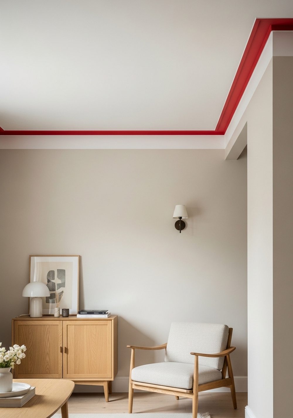
Instead of painting an entire wall red, try using it on ceiling trim for a subtle but surprising detail. This approach draws the eye upward and adds character without overwhelming the room. A warm red trim works especially well in neutral spaces that need a little life and definition. It pairs beautifully with white ceilings, soft beige walls, and natural wood furniture. The result feels architectural, creative, and polished, making even a simple room feel thoughtfully designed and more custom than expected every single day.
Best For: Living rooms, hallways, or dining spaces with plain architectural lines.
Where To Place It: Around crown molding, ceiling beams, or trim edges.
Color Palette Tip: Pair warm red with ivory, taupe, oak, and muted black accents.
Materials / Items Needed: paint, angled brush, painter’s tape, drop cloth, step ladder
Budget Level: Low — Small paint area, big visual impact.
DIY Difficulty: Medium — Clean lines matter, but the project is manageable.
Style It Like This: Keep walls neutral for contrast. Add warm wood tones nearby. Repeat red once in a small accessory.
Common Mistake To Avoid: Using a bright red that clashes harshly with the rest of the room.
Rust-Red Linen Curtains
Rust-red linen curtains bring softness and warmth while still feeling earthy and relaxed. They are a smart choice if you want red in the room without using anything shiny, sharp, or too dramatic. The natural texture of linen keeps the color grounded and easy to live with. In rooms filled with cream, tan, wood, or black accents, these curtains add movement and a cozy layered look. They also filter light beautifully, creating a rich glow that makes the space feel intimate, calm, and more inviting every day.
Best For: Bedrooms, living rooms, or reading corners needing warmth and texture.
Where To Place It: Full-length windows, sliding doors, or layered behind sheer panels.
Color Palette Tip: Use rust-red with cream, camel, olive, and walnut finishes.
Materials / Items Needed: linen curtains, curtain rod, rings or clips, steamer, measuring tape
Budget Level: Medium — Fabric panels cost more, but they transform the room.
DIY Difficulty: Easy — Simple installation with a big payoff.
Style It Like This: Let them puddle slightly. Pair with woven baskets. Add one dark accent for depth.
Common Mistake To Avoid: Choosing stiff synthetic fabric that makes red feel too harsh.
Deep Red Bookshelf Back Panel

Painting the back panel of a bookshelf deep red is an easy way to add color without committing to a whole feature wall. It creates depth behind books, ceramics, and framed objects, making everything on the shelf look more intentional. A darker red shade feels rich and sophisticated, especially in spaces with vintage, moody, or collected decor. This trick works beautifully in living rooms, offices, and bedrooms where shelving already exists. It is unexpected, stylish, and a great solution when a room feels flat or visually unfinished and uninspired.
Best For: Home offices, living rooms, or built-ins that need extra depth.
Where To Place It: Inside bookshelves, display cabinets, or open wall niches.
Color Palette Tip: Combine deep red with charcoal, brass, cream, and dark wood.
Materials / Items Needed: paint, mini roller, brush, shelf liner optional, screwdriver, drop cloth
Budget Level: Low — A small paint project with a designer look.
DIY Difficulty: Easy — Best for beginners comfortable with basic painting.
Style It Like This: Leave some shelf space open. Mix books with ceramics. Use warm metallic accents.
Common Mistake To Avoid: Overfilling shelves so the red background disappears completely.
Red Table Lamp Base

A red table lamp base can add just the right hit of color to a quiet room. It feels especially fresh when the shade stays neutral and the surrounding decor is simple. This is one of the easiest ways to test red without repainting, reupholstering, or replacing major furniture. A ceramic or lacquered base in a muted or rich red tone can make a console, side table, or nightstand feel styled and complete. It works like jewelry for the room, adding contrast, charm, and energy in a compact way.
Best For: Nightstands, console tables, desks, or under-styled corners.
Where To Place It: On side tables, entry consoles, or layered into shelf styling.
Color Palette Tip: Pair red with white, light oak, sandy beige, and soft black.
Materials / Items Needed: red lamp base, neutral shade, bulb, table surface, nearby accent decor
Budget Level: Medium — Affordable compared to larger furniture changes.
DIY Difficulty: Easy — Just place, plug in, and style around it.
Style It Like This: Keep the lampshade simple. Add a tray underneath. Repeat red in one tiny nearby object.
Common Mistake To Avoid: Pairing it with too many competing colorful accessories.
Muted Red Entryway Bench

A muted red bench in the entryway feels welcoming, useful, and unexpectedly stylish. Unlike brighter reds, a softened shade reads warm and lived-in, making it easier to blend with natural materials and everyday storage pieces. It instantly gives a plain entry more personality while providing a practical seat for shoes, bags, and quick drop-offs. Upholstered or painted wood versions both work beautifully depending on your style. This idea is especially effective in small homes where every piece should feel decorative and functional at the same time without looking too serious or stiff.
Best For: Small entryways, mudrooms, or apartment landing areas.
Where To Place It: By the front door, under hooks, or below a mirror.
Color Palette Tip: Use muted red with greige, basket tones, black metal, and warm white.
Materials / Items Needed: bench, cushion or paint, wall hooks, mirror, basket storage
Budget Level: Medium — Functional furniture with decorative value.
DIY Difficulty: Medium — Easier if updating an existing bench.
Style It Like This: Add a textured cushion. Place a mirror above. Use a basket underneath for storage.
Common Mistake To Avoid: Choosing a glossy finish that makes the bench feel too bold.
Brick-Red Bathroom Vanity

A brick-red bathroom vanity can make a basic bathroom feel custom and full of character. Because bathrooms often lean white, gray, or beige, this warm shade introduces depth in a way that feels fresh rather than overwhelming. Brick red looks beautiful with brass hardware, creamy walls, and small marble details. It works especially well in powder rooms where you can be a little more playful with color. If your bathroom feels plain or cold, this one change can create a collected, designer look without needing a full renovation or major remodel.
Best For: Powder rooms, guest baths, or dated bathrooms needing personality.
Where To Place It: On the vanity cabinet below the sink area.
Color Palette Tip: Pair brick red with cream, brass, marble, and warm greige.
Materials / Items Needed: cabinet paint, primer, brush, mini roller, new hardware, screwdriver
Budget Level: Medium — Less costly than replacing the vanity entirely.
DIY Difficulty: Medium — Prep matters for durability in humid spaces.
Style It Like This: Swap in brass handles. Add a framed mirror. Keep wall decor minimal.
Common Mistake To Avoid: Using a red undertone that clashes with existing tile.
Red Striped Throw Blanket

A red striped throw blanket is one of the easiest ways to make a room feel layered and alive. The striped pattern breaks up the intensity of red, so it feels playful and balanced instead of heavy. Draped over a sofa, armchair, or bed, it adds contrast and makes neutral furniture look more intentional. This works especially well in cozy, modern, cottage, or collected spaces where texture matters. It is also perfect for seasonal updates because you can shift the room’s mood quickly without changing anything permanent or spending much.
Best For: Sofas, beds, accent chairs, or reading corners.
Where To Place It: Draped loosely over seating or folded at the foot of a bed.
Color Palette Tip: Mix red stripes with oatmeal, denim blue, cream, and wood tones.
Materials / Items Needed: striped throw blanket, cushion pairing, neutral furniture, storage basket optional
Budget Level: Low — A simple update with instant warmth.
DIY Difficulty: Easy — No installation needed.
Style It Like This: Layer over neutral upholstery. Pair with one textured pillow. Let the stripes stay visible.
Common Mistake To Avoid: Adding too many patterned pieces that compete with the throw.
Cherry Red Dining Chairs

Cherry red dining chairs can completely transform a dining area that feels bland or overly safe. Because chairs are repeated around the table, the color looks intentional and graphic rather than random. This works beautifully with simple wood tables, white walls, and clean lighting where the chairs become the main personality piece. If bright cherry feels too bold, choose a softened finish or mix only two red chairs with neutral ones. The effect is still playful and modern. It is a great option for anyone wanting color that feels confident and memorable.
Best For: Dining rooms, breakfast nooks, or open-plan kitchen dining areas.
Where To Place It: Around a wood, marble, or painted dining table.
Color Palette Tip: Balance cherry red with white, light wood, black, and small brass details.
Materials / Items Needed: dining chairs, seat cushions optional, floor pads, table, nearby lighting
Budget Level: High — Multiple chairs add cost quickly.
DIY Difficulty: Medium — Easier if painting or reupholstering existing chairs.
Style It Like This: Keep the table simple. Add clear space around them. Use neutral dishes for balance.
Common Mistake To Avoid: Overcrowding the room with other bold statement pieces.
Red Framed Vintage Art Wall

Instead of focusing on red art, try using red frames around vintage prints or sketches. The frame color becomes the statement while the artwork itself stays softer and more versatile. This creates a gallery wall with personality, especially when mixed with antique-inspired pieces, black-and-white drawings, or muted landscapes. Red frames can make old art feel younger and more collected without losing its character. They also help tie together other red accents in the room. This idea works well when you want color at eye level without painting walls or buying large decor pieces.
Best For: Hallways, staircases, living rooms, or above sideboards.
Where To Place It: As a gallery wall or in pairs over furniture.
Color Palette Tip: Use red frames with sepia art, cream mats, and aged wood tones.
Materials / Items Needed: picture frames, vintage prints, hanging hardware, level, nails, kraft paper template
Budget Level: Medium — Affordable if you source secondhand art and frames.
DIY Difficulty: Medium — Layout planning makes the difference.
Style It Like This: Mix frame sizes. Use soft art inside. Keep spacing even for a polished look.
Common Mistake To Avoid: Using overly glossy frames that overpower delicate artwork.
Cranberry Kitchen Runner

A cranberry kitchen runner adds warmth to one of the most functional rooms in the house. Kitchens often need softness, and this rich red tone helps balance hard surfaces like tile, stone, stainless steel, and painted cabinetry. A runner also brings movement through narrow spaces and makes the room feel more finished. Choose a washed or vintage-style pattern so the red feels relaxed rather than sharp. This idea is especially useful in neutral kitchens that need color but not clutter. It feels practical, welcoming, and instantly more lived-in underfoot every single day.
Best For: Galley kitchens, long prep zones, or spaces in front of sinks.
Where To Place It: Along the main walkway, island side, or sink area.
Color Palette Tip: Pair cranberry with cream, wood, black fixtures, and warm stone.
Materials / Items Needed: kitchen runner, rug pad, vacuum, spot cleaner, nearby coordinating textile
Budget Level: Medium — A quality runner improves comfort and style.
DIY Difficulty: Easy — Just size it correctly and place it well.
Style It Like This: Choose a faded pattern. Repeat red in a bowl or towel. Keep counters uncluttered.
Common Mistake To Avoid: Buying a runner that is too narrow for the space.
Dark Red Interior Door

Painting one interior door dark red is a bold move that still feels controlled. It creates a strong visual anchor and makes an overlooked architectural element feel decorative. This works especially well in homes with mostly neutral walls where a single painted door can add depth without disrupting the whole palette. Dark red looks elegant with black hardware, warm wood floors, and soft white trim. It is a smart idea for offices, bedrooms, or dens where you want a little mood. The finish feels memorable, dramatic, and much more expensive than it is.
Best For: Home offices, dens, bedrooms, or hallway focal points.
Where To Place It: On a single door that already draws some attention.
Color Palette Tip: Pair dark red with white trim, black hardware, and medium wood.
Materials / Items Needed: door paint, primer, brush, mini roller, screwdriver, painter’s tape
Budget Level: Low — One door can create a luxury effect cheaply.
DIY Difficulty: Medium — Smooth prep and even coats are important.
Style It Like This: Keep surrounding walls pale. Add minimal decor nearby. Choose matte or satin over glossy.
Common Mistake To Avoid: Painting every door red and losing the focal effect.
Red Ceramic Vase Cluster

A cluster of red ceramic vases can bring life to shelves, coffee tables, and mantels without feeling forced. Grouping different shapes in related red tones creates variety while still reading as one styled moment. This is especially helpful in neutral rooms that need a focal point but not another large piece of furniture. Matte or slightly textured ceramics feel more elevated than glossy, bright finishes. Even without flowers, the arrangement has presence and warmth. It is an easy styling update that looks intentional, artistic, and far more expensive than many larger decor changes.
Best For: Coffee tables, open shelves, mantels, or console styling.
Where To Place It: In clusters of three on flat surfaces with breathing room.
Color Palette Tip: Mix red ceramics with travertine, cream, walnut, and smoky glass.
Materials / Items Needed: ceramic vases, tray optional, dried stems optional, styling books, surface space
Budget Level: Low — Small decor pieces can create a strong statement.
DIY Difficulty: Easy — Mainly about arrangement and spacing.
Style It Like This: Vary heights. Use odd numbers. Leave negative space around the grouping.
Common Mistake To Avoid: Mixing too many unrelated finishes that look messy together.
Terracotta-Red Bedside Nook

A terracotta-red bedside nook can make the sleeping area feel warmer, softer, and more personal. Paint a small section behind the nightstand, add a tiny shelf, or style the corner with red-toned accessories to create a gentle focal point. Terracotta is easier to live with than brighter reds because it feels earthy and calm. It pairs naturally with linen bedding, wood furniture, woven textures, and soft lighting. This idea works beautifully in bedrooms that need more depth but should still feel restful. The result is cozy, grounded, and quietly distinctive.
Best For: Bedrooms with simple layouts or plain wall space near the bed.
Where To Place It: Behind a nightstand, in a corner shelf area, or wall niche.
Color Palette Tip: Pair terracotta-red with flax, clay, oak, cream, and muted olive.
Materials / Items Needed: paint, shelf optional, lamp, small decor, bedding, wall hooks optional
Budget Level: Low — Great impact from a small styled zone.
DIY Difficulty: Easy — Ideal for a small weekend refresh.
Style It Like This: Use soft bedding. Add one ceramic piece. Keep the nook warm and uncluttered.
Common Mistake To Avoid: Choosing a red shade that feels too bright for a bedroom.
Red Accent Shelf Styling

Red accent shelf styling is perfect when you want color in tiny doses. Instead of one large red item, scatter a few carefully chosen pieces across a shelf display, such as a book spine, small bowl, candle holder, or framed object. This makes red feel collected and layered rather than loud. It also allows you to test the color before using it in bigger ways elsewhere in the room. The key is restraint. Just a few accents can brighten neutral shelving and make the whole arrangement feel more balanced, dynamic, and thoughtfully edited.
Best For: Built-ins, floating shelves, media units, or bookcases.
Where To Place It: Across different shelf levels with intentional spacing.
Color Palette Tip: Use red accents with beige, black, wood, stone, and soft gray.
Materials / Items Needed: books, bowl, candle holder, small art, shelf decor, storage boxes optional
Budget Level: Low — Easy to build slowly with small finds.
DIY Difficulty: Easy — No tools needed, just styling practice.
Style It Like This: Spread red across the display. Mix textures. Keep the rest of the shelf neutral.
Common Mistake To Avoid: Clustering all the red pieces in one crowded spot.
Conclusion
Red does not have to feel loud, formal, or intimidating in a home. When used in smaller, smarter, and more unexpected ways, it can bring warmth, depth, and real personality to a space. Start with one idea that feels easy for your room, then build from there if you love the result. Even a simple red detail can make your home feel more layered, curated, and full of life without overwhelming your everyday style.
FAQs
Q1: How do I decorate with red without making a room feel too bold?
A: Use red in smaller doses like lamps, textiles, frames, or shelf accents.
Ground it with neutrals, wood tones, and softer textures so it feels balanced.
Q2: Which shades of red work best for home decor?
A: Rust, brick, terracotta, cranberry, and deep wine tones are usually easiest to style.
They feel warmer, calmer, and more sophisticated than very bright primary reds.
Q3: What colors go well with red in interiors?
A: Red pairs beautifully with cream, beige, taupe, olive, walnut, black, and brass.
These combinations help red feel rich, modern, and livable.
Q4: Is red a good choice for small spaces?
A: Yes, especially when used as an accent instead of a full-room color.
A small red detail can energize a compact space without making it feel crowded.
Q5: Where should I start if I am nervous about using red?
A: Start with something removable like a throw blanket, runner, or vase cluster.
That gives you flexibility and helps you see how the color feels in your home.

